


Evaluation Metrics for Predicting Gene Expression
A Practical Guide to Evaluating Machine Learning Models in Genomics Research: Understanding MAE, RMSE, and R² Through the Lens of Gene Regulation


Liked this piece? Show your support by tapping the “heart” ❤️ in the header above. It’s a small gesture that goes a long way in helping me understand what you value and in growing this newsletter. Thanks so much!
🧬 Introduction to Quantitative Assessment in Genomics
In modern genomics research, we frequently need to predict continuous molecular measurements: gene expression levels, protein abundance, methylation states, or chromatin accessibility scores. The accuracy of these predictions can significantly impact our understanding of biological systems and disease mechanisms. While my previous article covered resampling methods for estimating model generalization, here we'll explore how to quantify prediction accuracy in ways that are meaningful for genomic applications.
When working with genomic data, choosing appropriate evaluation metrics becomes crucial. For instance, when predicting gene expression levels, we might care more about capturing the relative changes between conditions than the absolute expression values. Similarly, when predicting transcription factor binding affinities, even small systematic errors could lead to misidentification of regulatory relationships.
🧬 Mean Absolute Error: Understanding Expression Level Deviations
Regression is a data analysis technique that uses a known data point to predict a single unknown but related data point—for example, predicting someone's relative risk of stroke based on their systolic blood pressure.
The mean absolute error (MAE) is an easy way to determine how wrong your predictions are when solving regression problems. Specifically, the MAE quantifies the error in your predicted values versus the actual, expected values. The mean absolute error is defined as the average of the sum of absolute errors. The term 'absolute' conveys that the error values are made positive, so they can be added to determine the magnitude of error. Thus, one limitation of MAE is that there is no directionality to the errors, so we don't know if we're over or underpredicting.
The formula for mean absolute error (MAE) is as follows:
In genomics, the mean absolute error (MAE) provides an intuitive measure of prediction accuracy in the same units as our original measurements. For example, when predicting log2-transformed RNA-seq counts, an MAE of 0.5 means our predictions deviate from the actual expression values by an average of 0.5 log2 units in either direction.
Let's demonstrate this using synthetic gene expression data that mirrors real-world patterns:
import numpy as np
import pandas as pd
from sklearn.model_selection import KFold
from sklearn.model_selection import cross_val_score
from sklearn.linear_model import LinearRegression

# Generate synthetic gene expression data with realistic patterns
np.random.seed(42)
n_genes = 1000

# Create features that influence gene expression
data = pd.DataFrame({
    'gc_content': np.random.normal(0.5, 0.1, n_genes).clip(0.2, 0.8),
    'chromatin_access': np.random.beta(2, 2, n_genes),
    'tf_binding_score': np.random.exponential(1, n_genes),
    'promoter_strength': np.random.normal(0, 1, n_genes),
    'enhancer_count': np.random.poisson(2, n_genes)})

# Generate log2 expression values with realistic relationships
base_expression = 6  # Typical log2 base expression
expression = (base_expression +
             2 * (data['gc_content'] - 0.5) +     # GC content effect
             3 * data['chromatin_access'] +        # Accessibility effect
             1 * data['tf_binding_score'] +        # TF binding effect
             2 * data['promoter_strength'] +       # Promoter effect
             0.5 * data['enhancer_count'] +        # Enhancer effect
             np.random.normal(0, 0.5, n_genes))    # Technical/biological noise
data['log2_expression'] = expression.clip(0, 15)   # Realistic expression range

# Prepare data for modeling
X = data.drop('log2_expression', axis=1)
y = data['log2_expression']

# Evaluate using k-fold cross-validation
kfold = KFold(n_splits=10, shuffle=True, random_state=42)
model = LinearRegression()
mae_scores = cross_val_score(model, X, y, cv=kfold,
                           scoring='neg_mean_absolute_error')

print(f'Average Expression Level (log2): {y.mean():.2f}')
print(f'MAE: {-mae_scores.mean():.2f} log2 units')
print(f'MAE Standard Deviation: {mae_scores.std():.2f} log2 units')
Which produces the following output:
Average Expression Level (log2): 9.40
MAE: 0.40 log2 units MAE
Standard Deviation: 0.03 log2 units
The MAE provides a straightforward interpretation for genomics researchers: "On average, our predictions deviate from actual expression levels by X log2 units." This metric is particularly useful when comparing expression predictions across different experimental conditions or tissue types.
🧬 Root Mean Squared Error: Capturing Expression Outliers
The root mean squared error (RMSE) is one of the most commonly used evaluation metrics for regression problems.
RMSE is the square root of the mean of squared differences between actual and predicted outcomes. Squaring each error forces the values to be positive. Calculating the square root of the mean squared error (MSE) returns the evaluation metric to the original units, which is useful for presentation and comparison. The formula for root mean squared error (RMSE) is as follows:
When studying gene expression, we're particularly interested in genes that show dramatic and unexpected changes in their activity levels, as these often signal important biological events. Imagine monitoring the activity levels of thousands of genes - while most follow predictable patterns with small fluctuations, some genes might suddenly switch from very low to very high activity (or vice versa) during key cellular events. For example, when a stem cell transforms into a heart cell, certain genes rapidly shift from being nearly silent to highly active, orchestrating this crucial cellular transformation. These large discrepancies between predicted and actual gene activity levels can point us toward genes involved in critical biological processes like cell fate decisions, stress responses, or disease progression. This is why RMSE (Root Mean Squared Error) is especially valuable as a measurement tool - by squaring errors before averaging them, it gives much more weight to these large prediction errors compared to MAE (Mean Absolute Error). For instance, if a gene's expression level is off by a factor of 6, RMSE will count this as 36 times more significant than a small error (due to squaring), while MAE would only count it as 6 times more significant. This mathematical property makes RMSE particularly adept at highlighting genes that might be undergoing biologically meaningful transitions, helping researchers identify key regulatory switches and cellular state changes that warrant further investigation.
Let's calculate RMSE using our synthetic expression data:
import numpy as np
from sklearn.metrics import mean_squared_error
from sklearn.model_selection import cross_val_score

# Calculate RMSE using cross-validation
mse_scores = cross_val_score(model, X, y, cv=kfold, scoring='neg_mean_squared_error')
rmse = np.sqrt(-mse_scores.mean())
print(f'RMSE: {rmse:.2f} log2 units')

# Compare to MAE to understand error distribution
mae = -mae_scores.mean()
print(f'RMSE/MAE Ratio: {rmse/mae:.2f}')

# Identify genes with largest prediction errors
model.fit(X, y)
predictions = model.predict(X)
error_df = pd.DataFrame({'actual': y,'predicted': predictions,'abs_error': np.abs(predictions - y)})
print("\nGenes with largest prediction errors:")
print(error_df.nlargest(5, 'abs_error'))
Which produces the following output:
RMSE: 0.51 log2 units
RMSE/MAE Ratio: 1.29

Genes with largest prediction errors:
       actual  predicted  abs_error
914  15.00000  17.682243   2.682243
586  15.00000  17.506164   2.506164
617  15.00000  17.093020   2.093020
944  15.00000  17.017776   2.017776
199  10.71434   8.949550   1.764790
When the RMSE/MAE ratio is notably larger than 1, it suggests the presence of genes whose expression levels are particularly difficult to predict. These might represent genes under complex regulatory control or genes responding to unmeasured factors.
🧬 R-squared: Understanding Explained Expression Variation
The R², also known as the coefficient of determination, is an evaluation metric that provides an indication of the goodness of fit of a set of predictions as compared to the actual values. The R² metric is scored from 0 to 1, where 1 is a perfect score and 0 means the predictions are entirely random and arbitrary.
The coefficient of determination (R²) helps us understand how much of the variation in gene expression we can explain with our predictors. In genomics, interpretation of R² must consider both technical and biological variation. For example, even a moderate R² might be impressive when predicting expression across different cell types or conditions.
Let's calculate R² for our expression model:
# Calculate R-squared using cross-validation
r2_scores = cross_val_score(model, X, y, cv=kfold, scoring='r2')
print(f'R² Mean: {r2_scores.mean():.3f}')
print(f'R² Standard Deviation: {r2_scores.std():.3f}')

# Analyze feature importance
model.fit(X, y)
importance = pd.DataFrame({'feature': X.columns, 'coefficient': model.coef_})
print("\nFeature Importance in Expression Prediction:")
print(importance.sort_values('coefficient', ascending=False))
Which produces the following output:
R² Mean: 0.954
R² Standard Deviation: 0.009

Feature Importance in Expression Prediction:
             feature  coefficient
1   chromatin_access     2.962094
0         gc_content     2.008781
3  promoter_strength     1.947350
2   tf_binding_score     0.921917
4     enhancer_count     0.493094
🧬 Visualizing Expression Prediction Performance
When analyzing gene expression predictions, visualization becomes a powerful tool for uncovering biological patterns that might be missed by summary statistics alone. Two particularly informative visualizations can help us understand how well our model captures gene expression dynamics: the MA-plot and the error distribution plot.
The MA-plot, originally developed for analyzing microarray data, has become a standard tool in genomics for identifying systematic biases in expression measurements. In our context, we adapt it to examine how prediction errors vary across different expression levels:
import matplotlib.pyplot as plt
import seaborn as sns
from sklearn.model_selection import cross_val_predict

# Generate predictions using cross-validation
predictions = cross_val_predict(model, X, y, cv=kfold)

# Create MA-plot with biological interpretation
plt.figure(figsize=(10, 6))
sns.scatterplot(x=(y + predictions)/2, y=predictions - y, alpha=0.5,
hue=abs(predictions - y),  palette='viridis')

# Add reference line for perfect prediction
plt.axhline(y=0, color='r', linestyle='--', label='Perfect Prediction')

# Customize plot for clarity
plt.xlabel('Average Expression Level (log2)')
plt.ylabel('Prediction Error (log2)')
plt.title('MA-plot: Expression-Dependent Prediction Bias')

# Add annotation regions
plt.annotate('Underestimated\nHigh Expressors', xy=(12, -2), xytext=(12, -3),arrowprops=dict(arrowstyle='->'))
plt.annotate('Overestimated\nLow Expressors', xy=(4, 2), xytext=(4, 3),
arrowprops=dict(arrowstyle='->'))
plt.legend(title='Error Magnitude')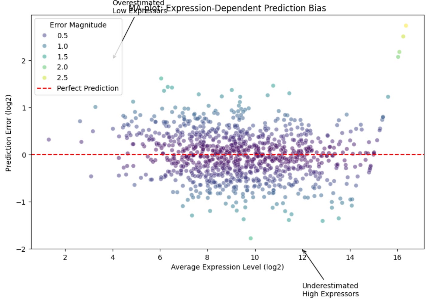
This visualization tells us several important things about our predictions:
Expression-dependent bias: Any systematic tilt in the cloud of points suggests our model consistently over- or under-predicts genes at certain expression levels
Heteroscedasticity: If the spread of points widens at higher expression levels, this suggests our prediction uncertainty increases with expression magnitude
Outlier genes: Points far from the y=0 line might represent genes under complex regulation or responding to unmeasured factor
The distribution of prediction errors provides complementary information about our model's performance:
# Create error distribution plot with biological context
plt.figure(figsize=(12, 6))

# Create main error distribution
sns.histplot(predictions - y, bins=50, stat='density')

# Add a kernel density estimate
sns.kdeplot(predictions - y, color='red', linewidth=2)

# Customize plot
plt.xlabel('Prediction Error (log2)')
plt.ylabel('Density')
plt.title('Distribution of Expression Prediction Errors')

# Add vertical lines for different error magnitudes
plt.axvline(x=0, color='green', linestyle='--', label='Perfect Prediction')
plt.axvline(x=1, color='orange', linestyle='--', label='2-fold Error')
plt.axvline(x=2, color='red', linestyle='--', label='4-fold Error')

# Add biological interpretation
plt.annotate('Technical\nVariation\nRegion', xy=(0.5, plt.gca().get_ylim()[1]/2), xytext=(1, plt.gca().get_ylim()[1]/1.5),arrowprops=dict(arrowstyle='->'))

plt.legend(title='Error Magnitudes')
This distribution plot reveals crucial information about prediction quality:
Bias: The center of the distribution should be at zero for unbiased predictions
Technical variation: Errors within ±0.5 log2 units often represent normal technical variation in expression measurements
Biological variation: Larger errors (>1 log2 unit) might indicate genes responding to unmeasured biological factors
Heavy tails: A distribution with heavy tails suggests the presence of genes whose expression is particularly hard to predict, often due to complex regulatory mechanisms
Together, these visualizations help us understand not just how well our model performs overall, but also which genes and expression ranges might need closer investigation or improved prediction methods.
🧬 Advanced Considerations for Genomic Data
When working with gene expression data, several special considerations affect our choice of evaluation metrics:
Scale Dependencies: RNA-seq data often spans several orders of magnitude. Consider whether to evaluate predictions on raw counts, log-transformed values, or normalized expression scores.
Biological Relevance: Sometimes being wrong by a factor of two (one log2 unit) matters more for lowly expressed genes than highly expressed ones. Consider using custom evaluation metrics that weight errors based on expression level.
Technical Variation: Account for technical noise when interpreting prediction errors. If your prediction error is similar to technical replicate variation, you may be approaching optimal performance.
Missing Values: RNA-seq data often contains zeros that may represent either true absence of expression or technical dropouts. Consider how your evaluation metrics handle these cases.
🧬 Conclusion: Integrated Evaluation in Genomics
In genomic applications, no single metric tells the complete story. MAE provides interpretable error magnitudes, RMSE highlights potentially interesting outliers, and R² helps us understand our model's explanatory power within the context of gene expression variation.
For expression prediction specifically, consider:
Using MAE for clear communication with other researchers
Monitoring RMSE to identify genes with unusual regulation
Examining R² in the context of known technical and biological variation
Visualizing predictions to understand model behavior across expression ranges
Implementing custom metrics that capture biological relevance
Remember that the choice of metric should align with your biological questions and the downstream applications of your predictions. Whether you're studying differential expression, identifying regulatory relationships, or predicting disease states, your evaluation metrics should reflect what matters most for your specific research goals.